2020 colours: The new year’s hottest trends
Decor trend enthusiasts, rejoice! The colours that will define the next year have been unveiled by the paint companies. Our designers have carefully selected the colours that will be presented in our showroom: read on for 2020’s hottest hues and how to integrate them into your decor.
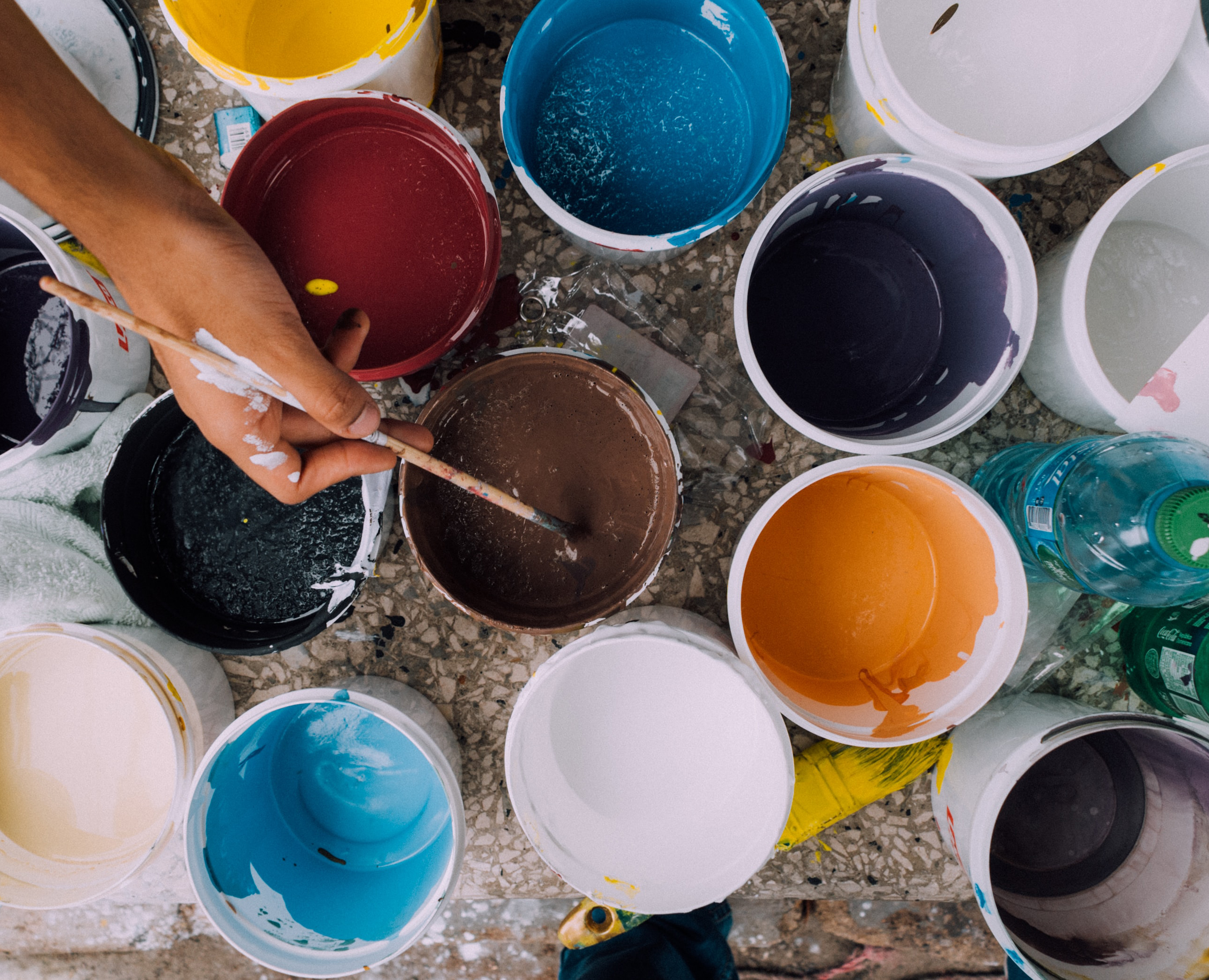
Our experts on the colour trends for 2020
Last year, we brought you up to speed on the big trends in paint colours, and now it’s already time again to look ahead at the year to come and the latest colours catching our designers’ eyes. From deep, rich shades to calmer hues and timeless neutrals, we’ve put together a beautiful palette to inspire you!

Teal (and other deep shades of green and blue) is making a major comeback in all different kinds of decors. As an accent, it brings a shot of colour to the room, and in larger doses, it has a strong visual impact. A whole room in teal creates a dramatic and enticing atmosphere. Light colours contrast beautifully with teal, while metal and gilded accents heighten its elegance. Add touches of pink and terracotta for a bright and original look in perfect step with the latest trends.
Ever-versatile green is also all the rage this year, pairing perfectly with natural materials. Shades like khaki, sage and slate green bring nature right into your home.

Tones on the spectrum from grape to chestnut, not to mention the rich hues of eggplant, are also commanding attention: these deep colours suggest elegance and a certain theatrical flair. Pair them with paler tones to create a striking contrast.

Following on the heels of the charcoal grey we’ve seen everywhere the last few years, deep greys with undertones of blue or navy will be stealing the show next year. These greys have a soothing effect, inviting peace and relaxation. Perfectly suited to chic, elegant and urban decors, they also work well with natural materials like wood for that delicate balance of warm and cold tones. We also like bringing in some brighter hues to cast a little light on these mysterious, moody greys.
Mineral neutrals like grey are a perfect complement to bolder tones, softening them for a modern look. We love these colours in minimalist decors, to highlight those special pieces you’ve handpicked so carefully.
After making a splash in the fashion world over the last few years, yellow is now showing up in shades of mustard, gold and ochre to brighten up our interiors. Yellow creates warmth and light, encouraging a feeling of well-being. In some contexts, it can evoke luxury; in others, paired with retro furnishings or accessories, it’s a nostalgic throwback. We like it with neutral tones as well as with bolder colours like a deep blue or green, and you can even pair it with a warm red or terracotta.

Speaking of warmth and vitality, reds with orange undertones are also popping up in new decors. This warm shade is an ideal backdrop for natural materials. These reds are a gorgeous match with classic shades, but don’t be shy about pairing them with a bright colour like blue either for a particularly spectacular effect.
Want to highlight your front door with one of these trendy shades? Give some thought to choosing a colour adapted to your personality. And while you’re revamping your front door, why not make a few more updates to freshen up your home’s façade for minimal investment?
We’ve got more colour ideas to brighten up your front door right here!